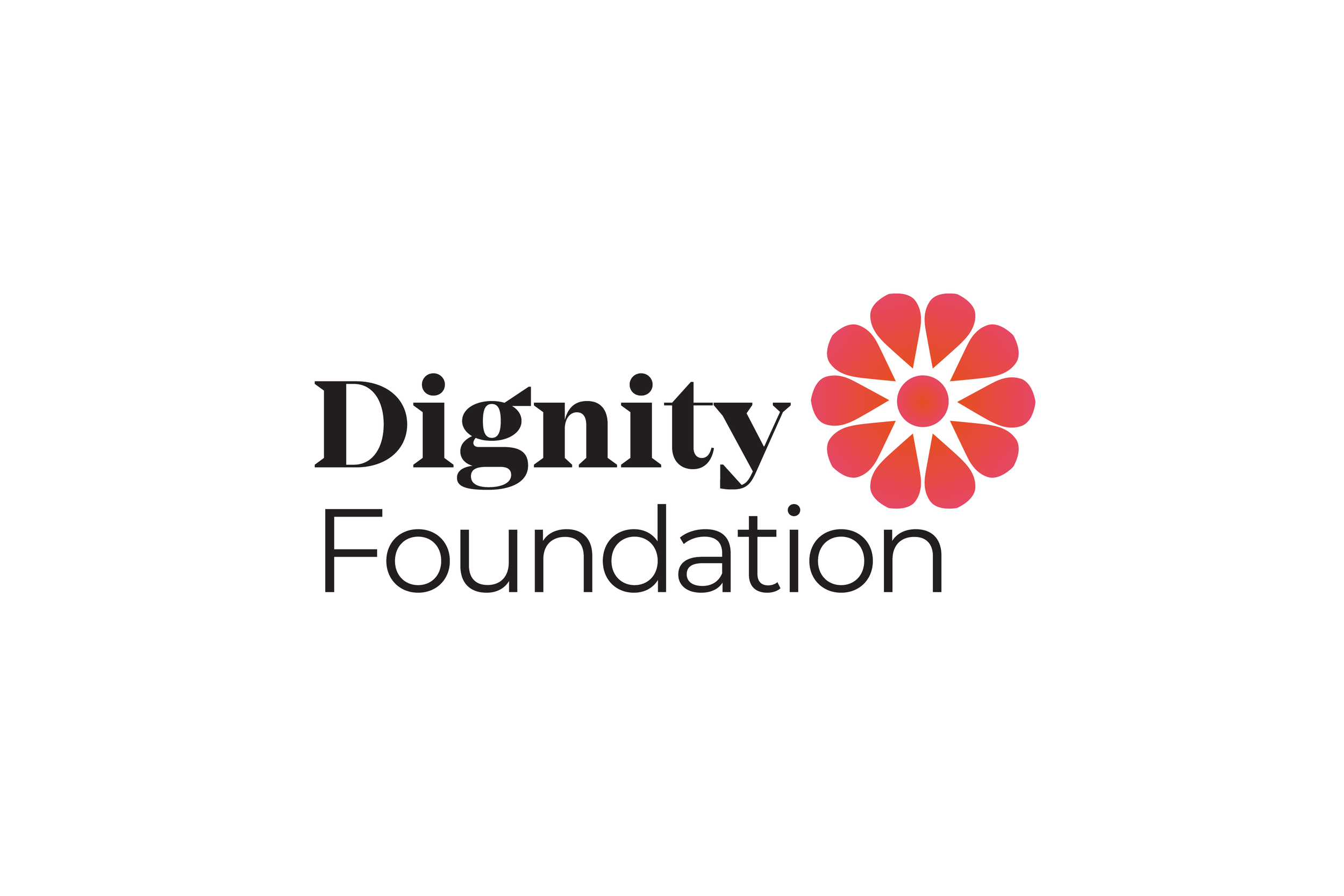
Dignity Foundation
Dignity Foundation is a much loved non-profit organisation that helps senior citizens lead active lives through various productive ageing and social support services. Over the years, Dignity has grown both in size, locations and programmes. Despite its clear mission, an inconsistent approach to identity and communications had left it with a brand that did not convey the full breadth of its offerings and expertise.
We worked closely with NGO to develop a brand strategy and visual identity that would present Dignity Foundation as both a compassionate caregiver and a leading authority in the welfare of senior citizens, creating a brand that strikes a balance between warmth and expertise, putting the NGO’s multi-faceted offering at the centre of the story.
Our approach was to strike out against some of the negative connotations associated with the language and ways of the charity sector, which often leans onto shock tactics, well- worn images, over- sentimental language. Instead the new Dignity brand deploys a visual language and tone of voice that speaks with joy, respect, expertise and endeavour.
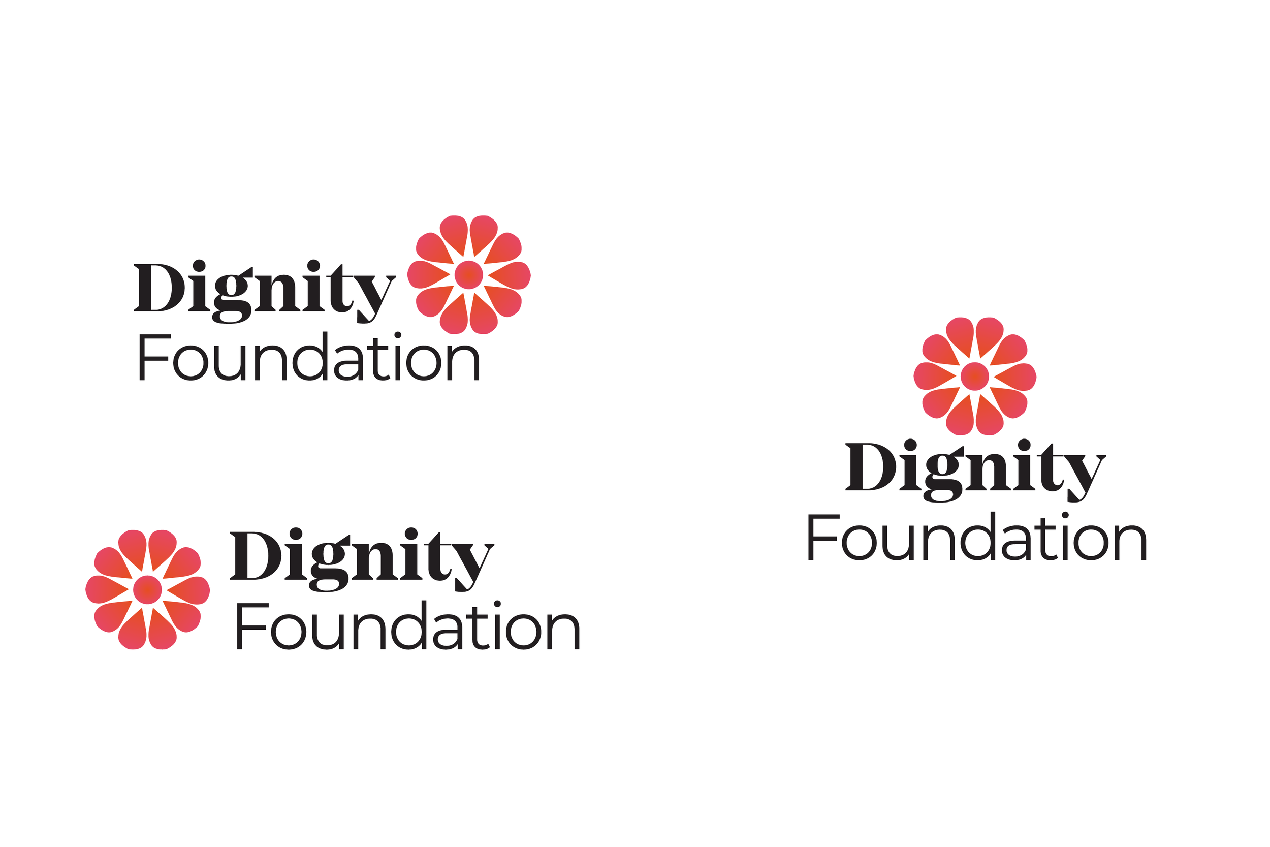
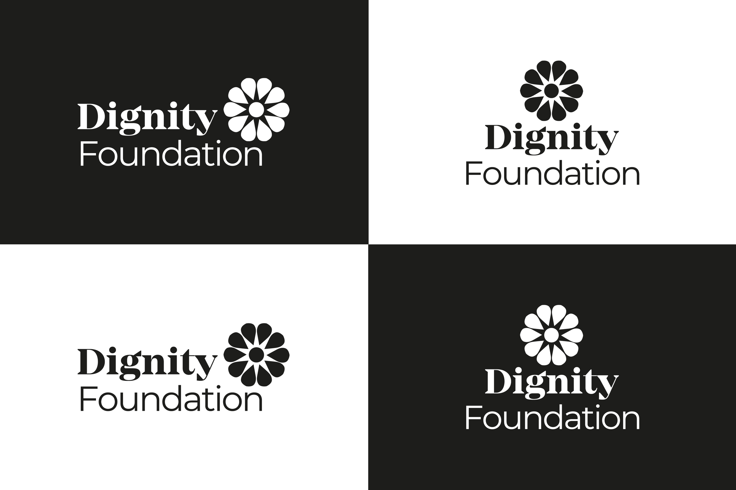
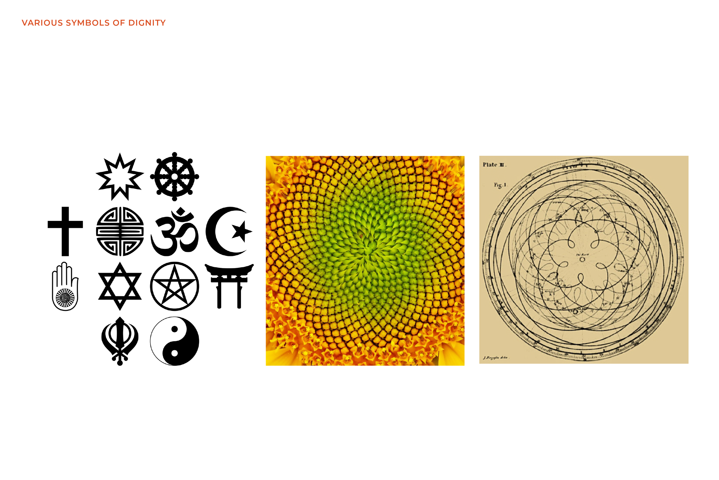
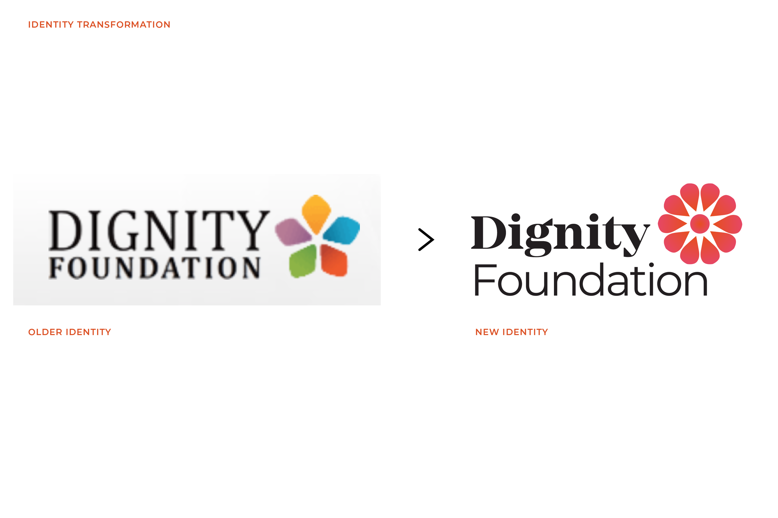
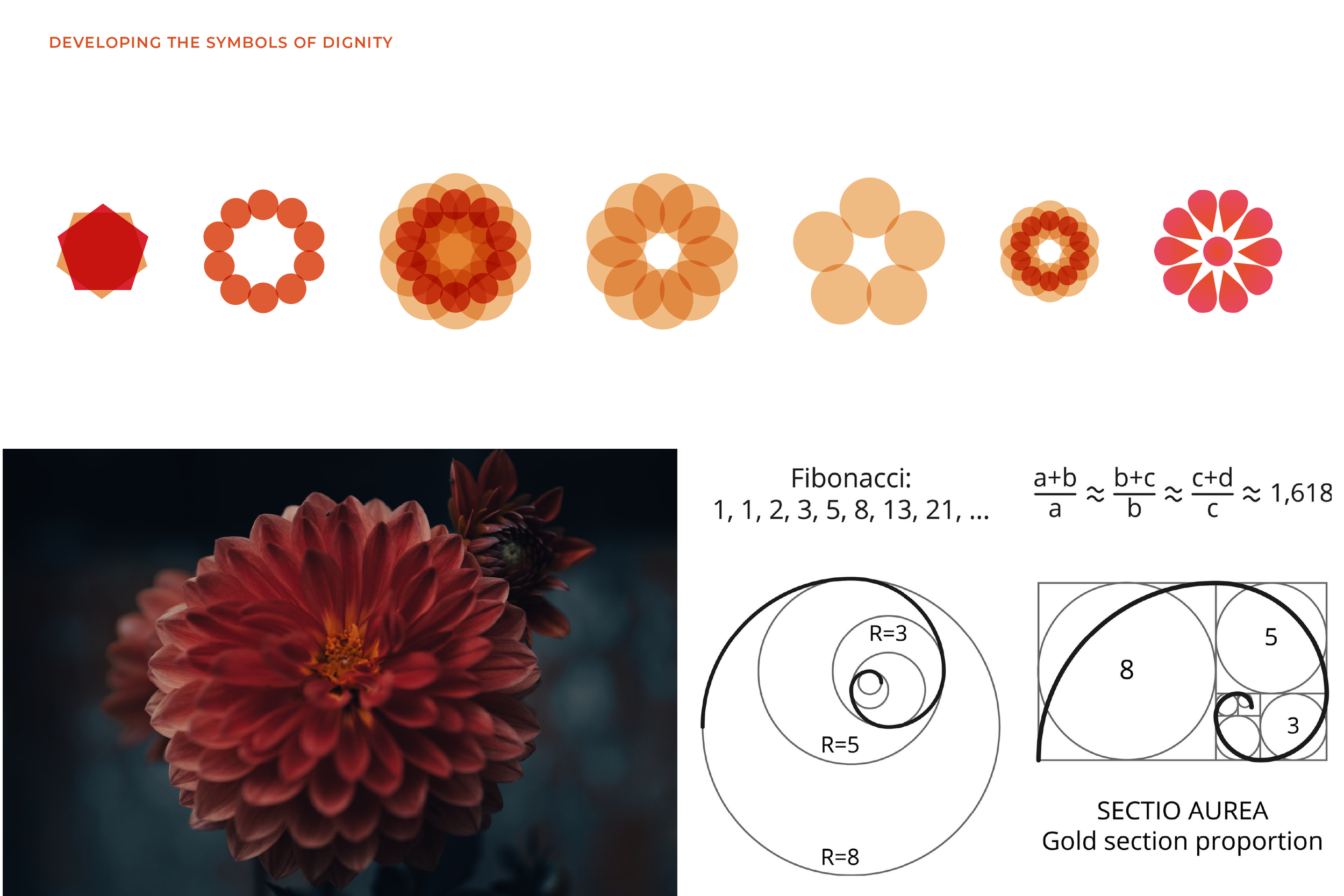
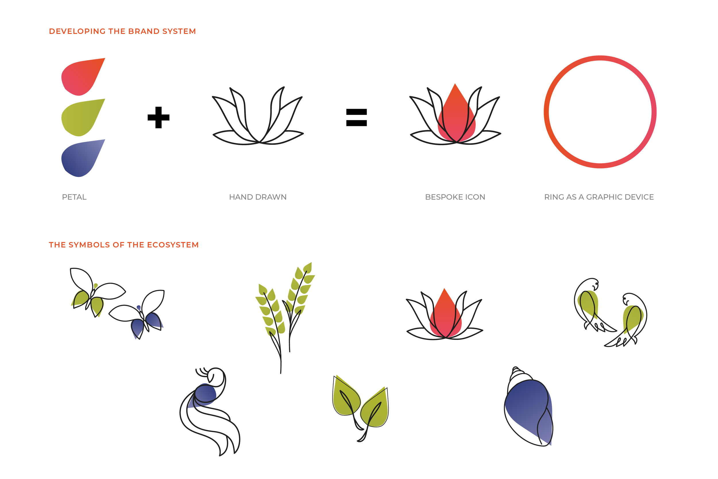
We investigated the symbols of dignity over the ages across cultures. The various stars and the dahlia flower emerged strongly as symbols that signify dignity and respect. We explored the idea of merging the star and dahlia flower into a 10 petal flower that was built on the principles of the golden proportions. This formed the new mark for Dignity Foundation.
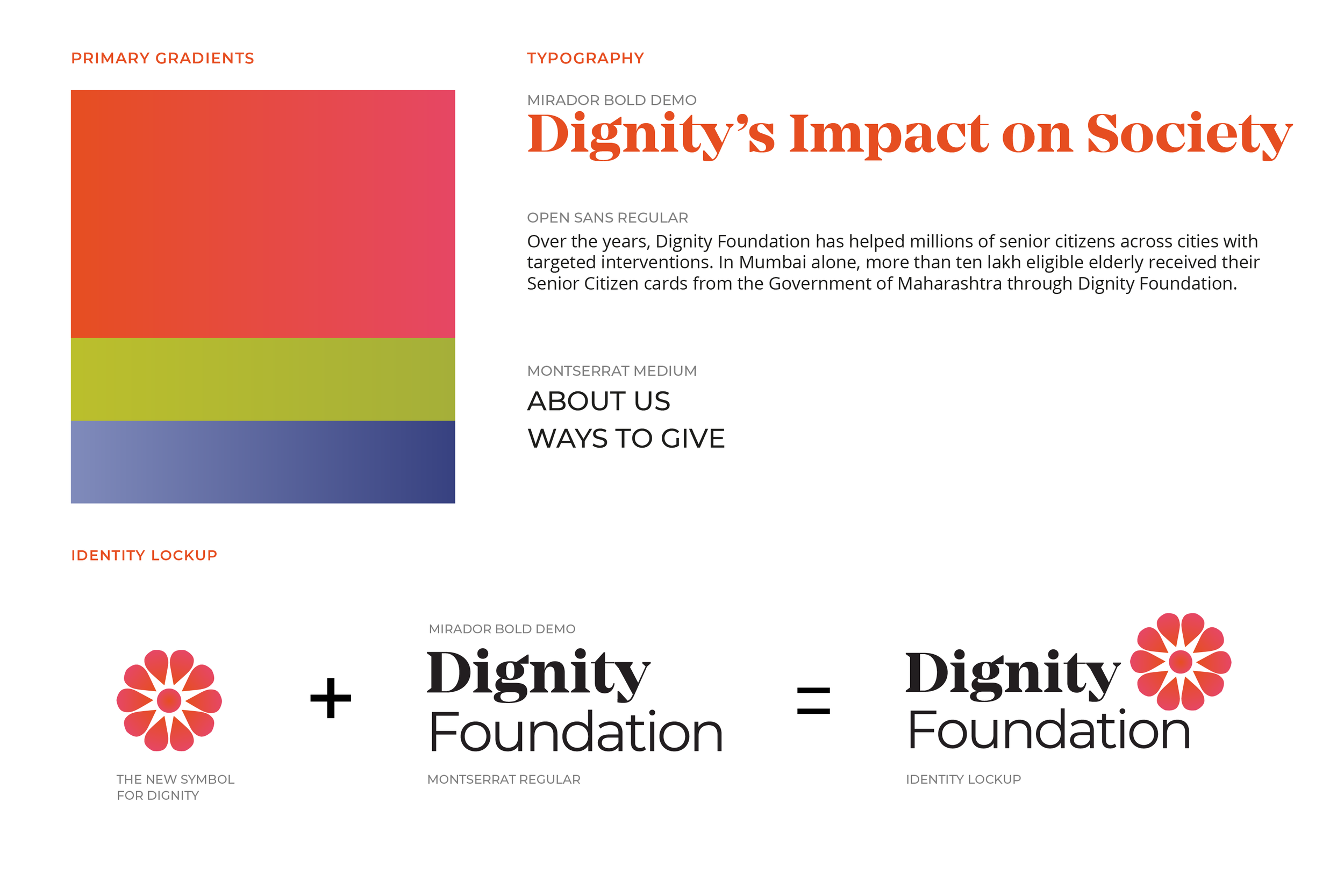
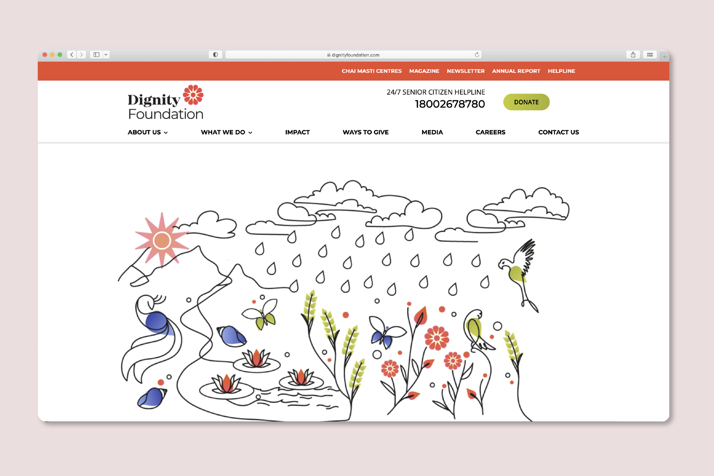
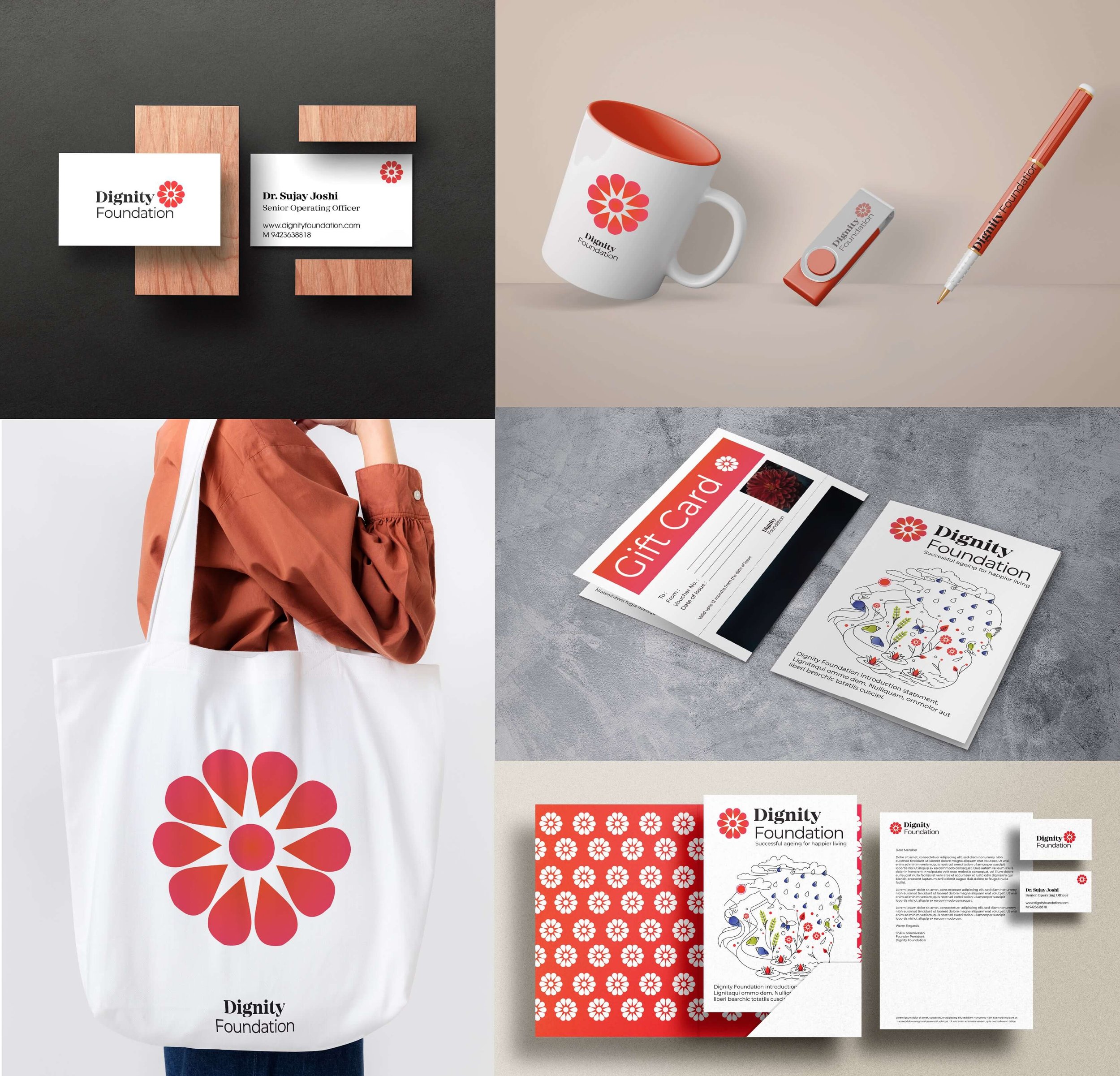
The colours we chose were a bright Indian vermilion red-orange that symbolises the colour of life and eternity. The chosen typefaces for the identity are a balance of warmth and humanity as well as authority and expertise. The approach to photography is natural, candid moments that demonstrate empathy and help build a real connection with all the members of the foundation.
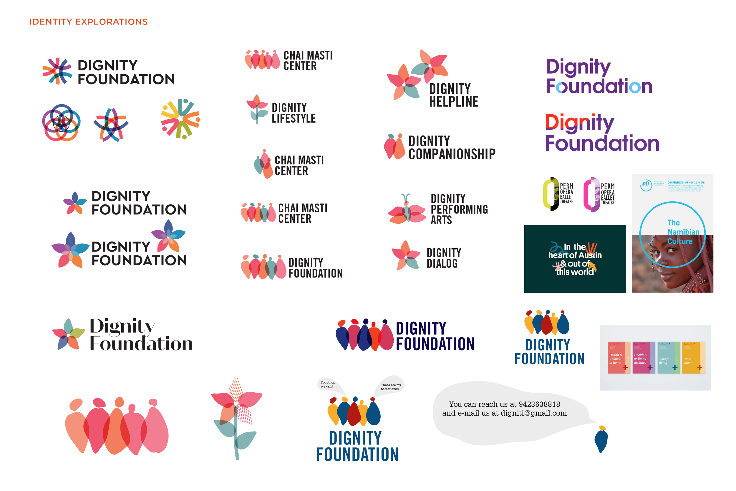
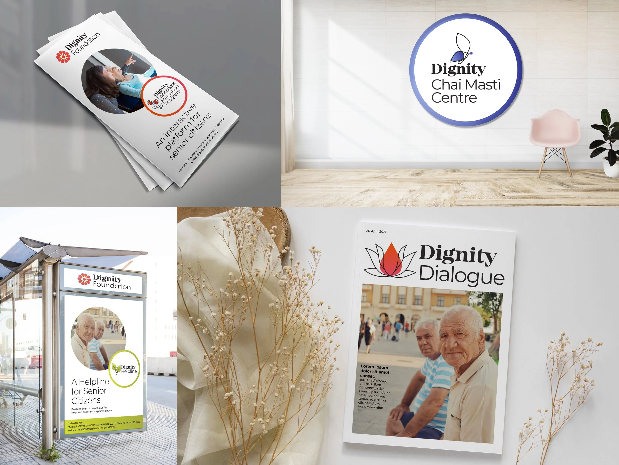
We extended the brand system to create a “Circle of life” which portrays the new symbol of dignity as part of a larger ecosystem. From this ecosystem we derived flora and fauna symbols that would further be associated with the various programmes of the foundation. Butterflies for the Chai Masti centre, chaffs of wheat for Dignity Anand Daan, a pair parrots for the Dignity Loneliness Mitigation Programme, a peacock for the Dignity Performing arts and so on. The symbols for the circle of life are hand drawn expressing warmth, kindness and humanity with the individual petal from the flower at the heart of each icon. The “circle of life” helped the foundation approach its myriad offerings not as a series of unrelated programmes but instead approach its various activities as an ecosystem under one master brand.
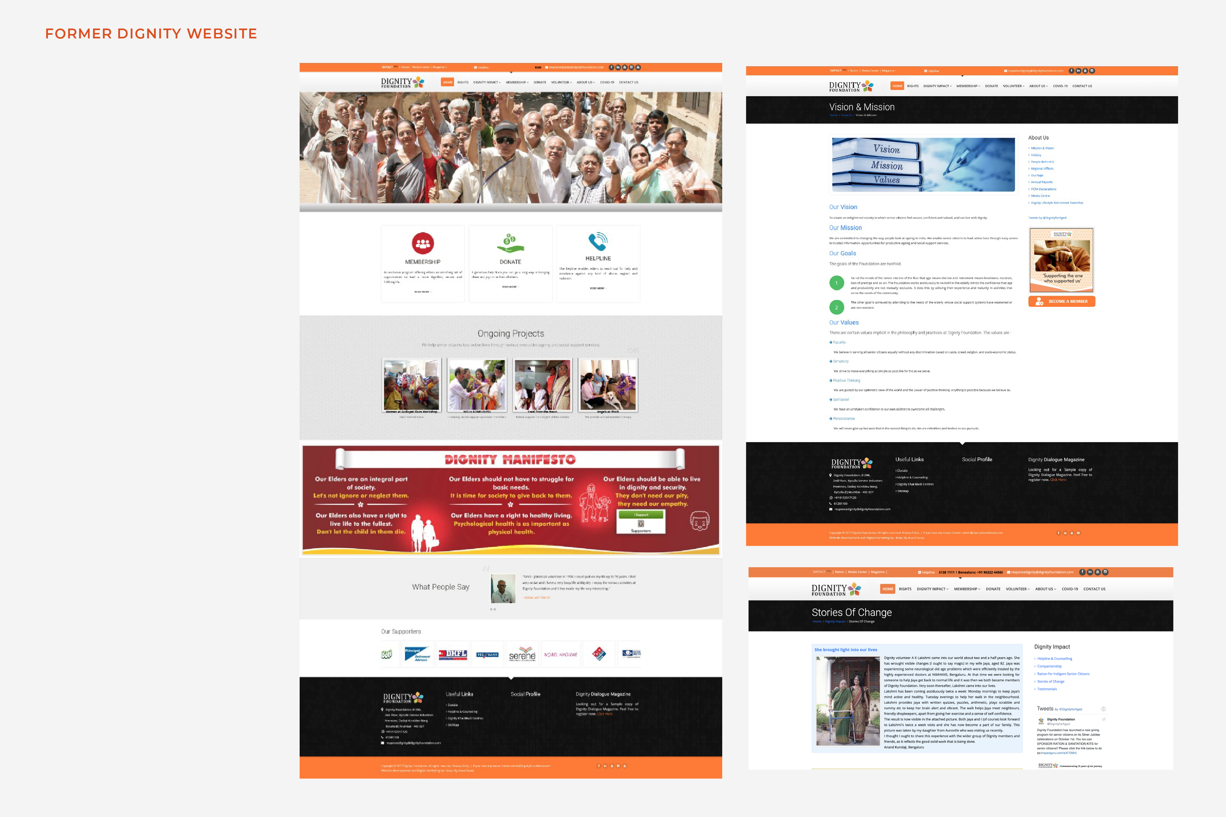
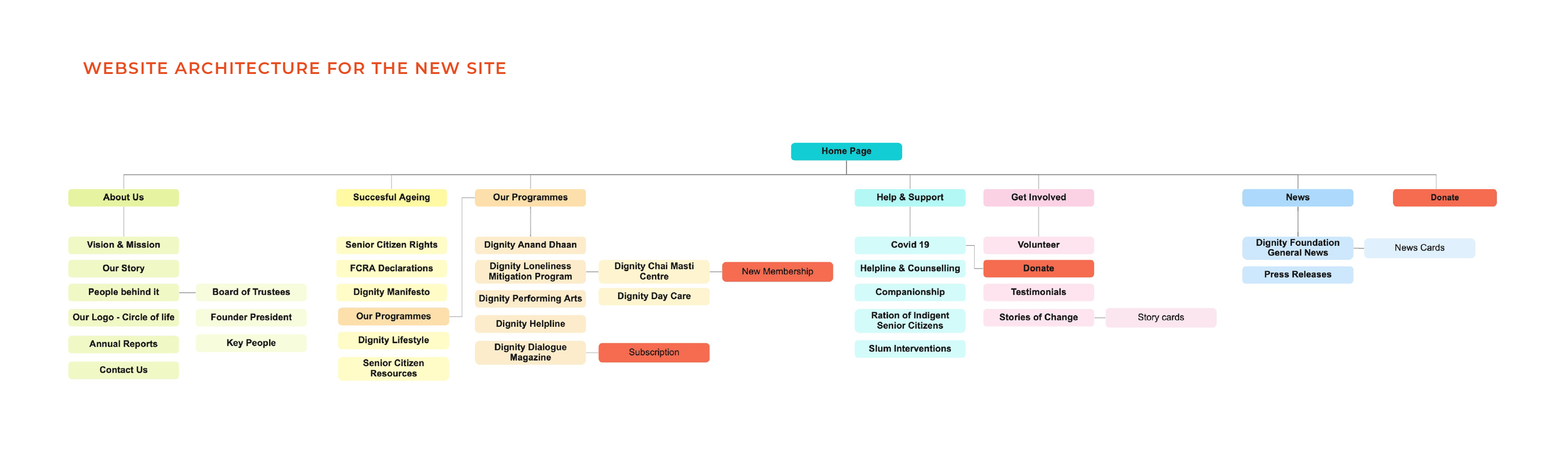
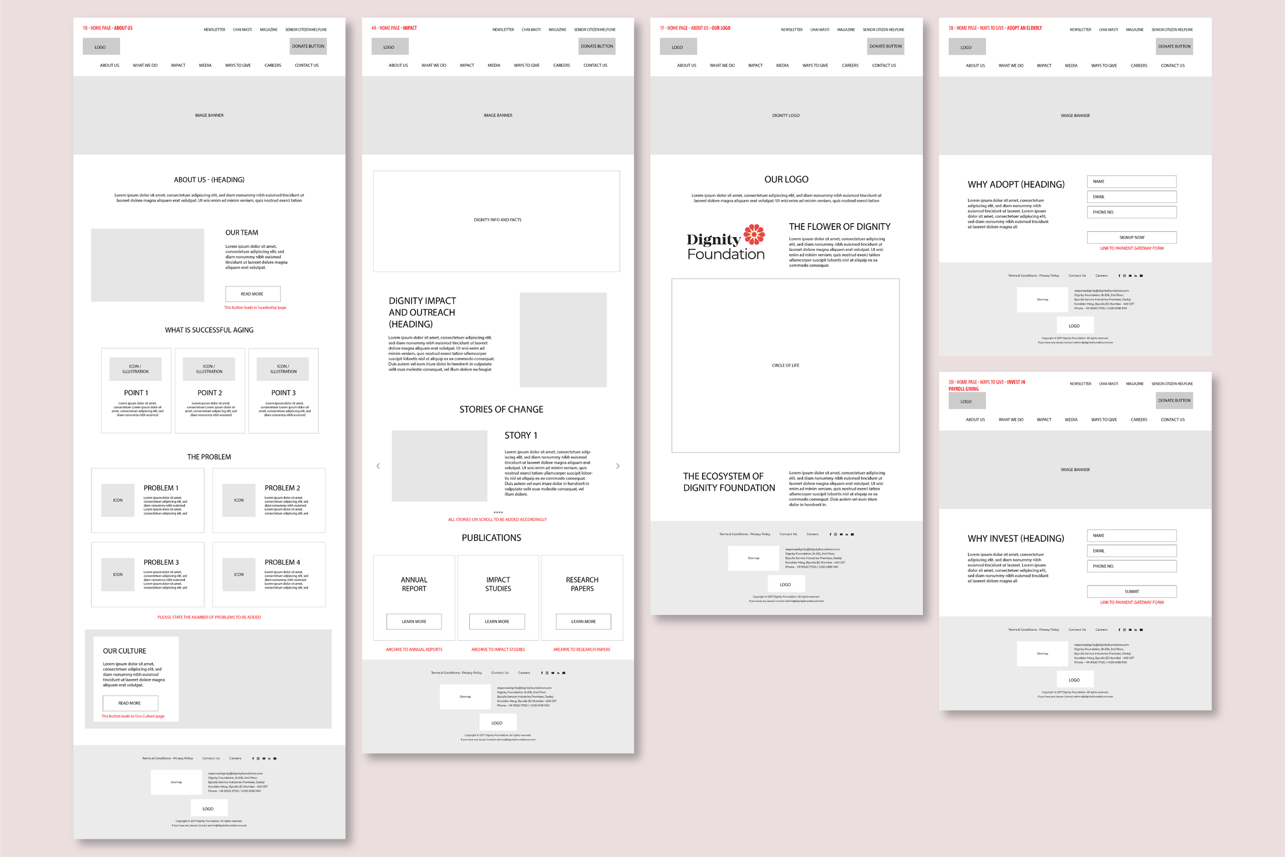
The former Dignity website posed the problem of too much information and lengthy descriptions. We addressed the navigation and user experience on the website, created a clear web architecture, hierarchy of information and programs, donation and volunteer forms.
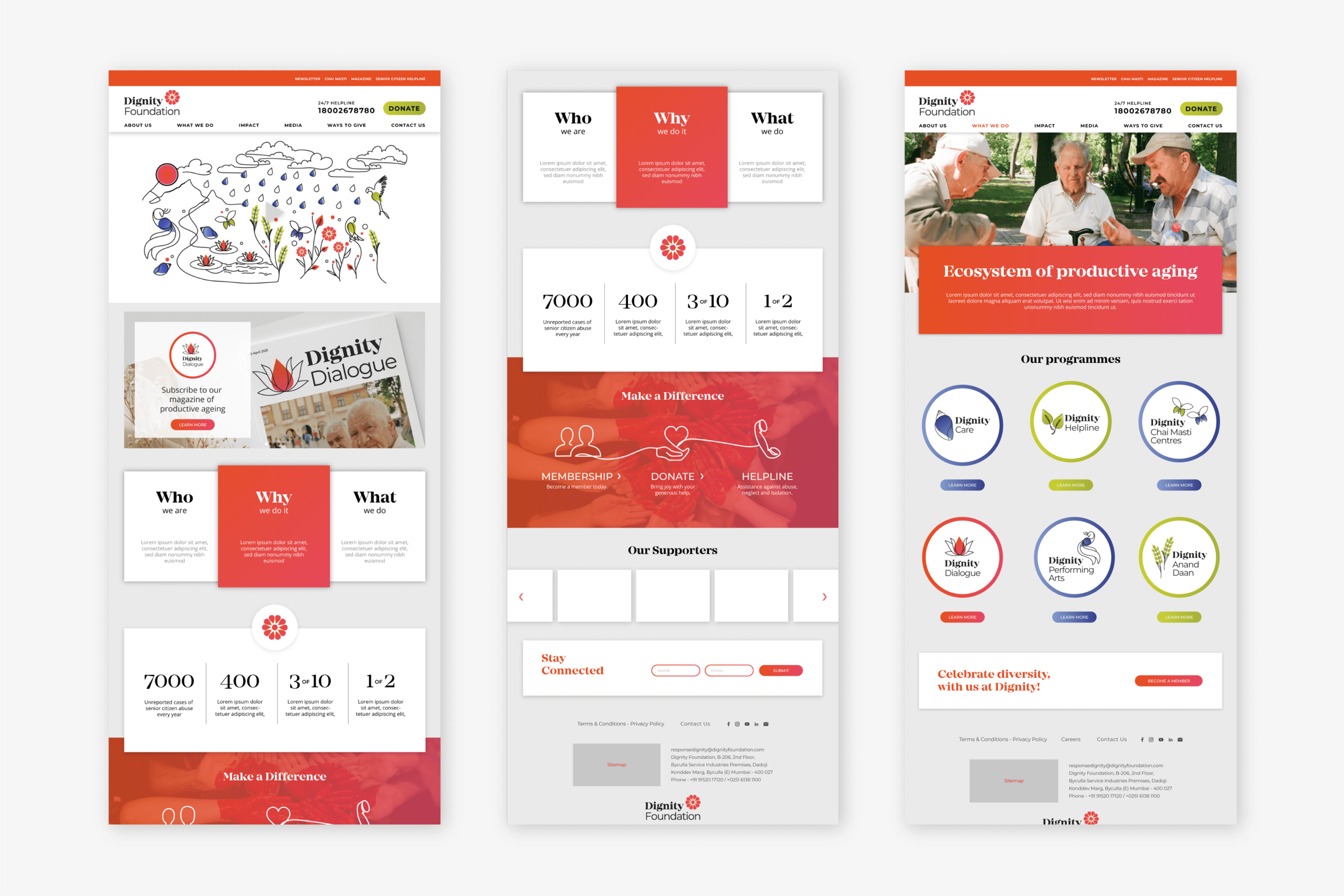
The design follows the brand guidelines for the new rebrand bringing forth positive imagery and copy and call to action headlines. The orange red is a bright beacon that sets up a positive space for the foundation.
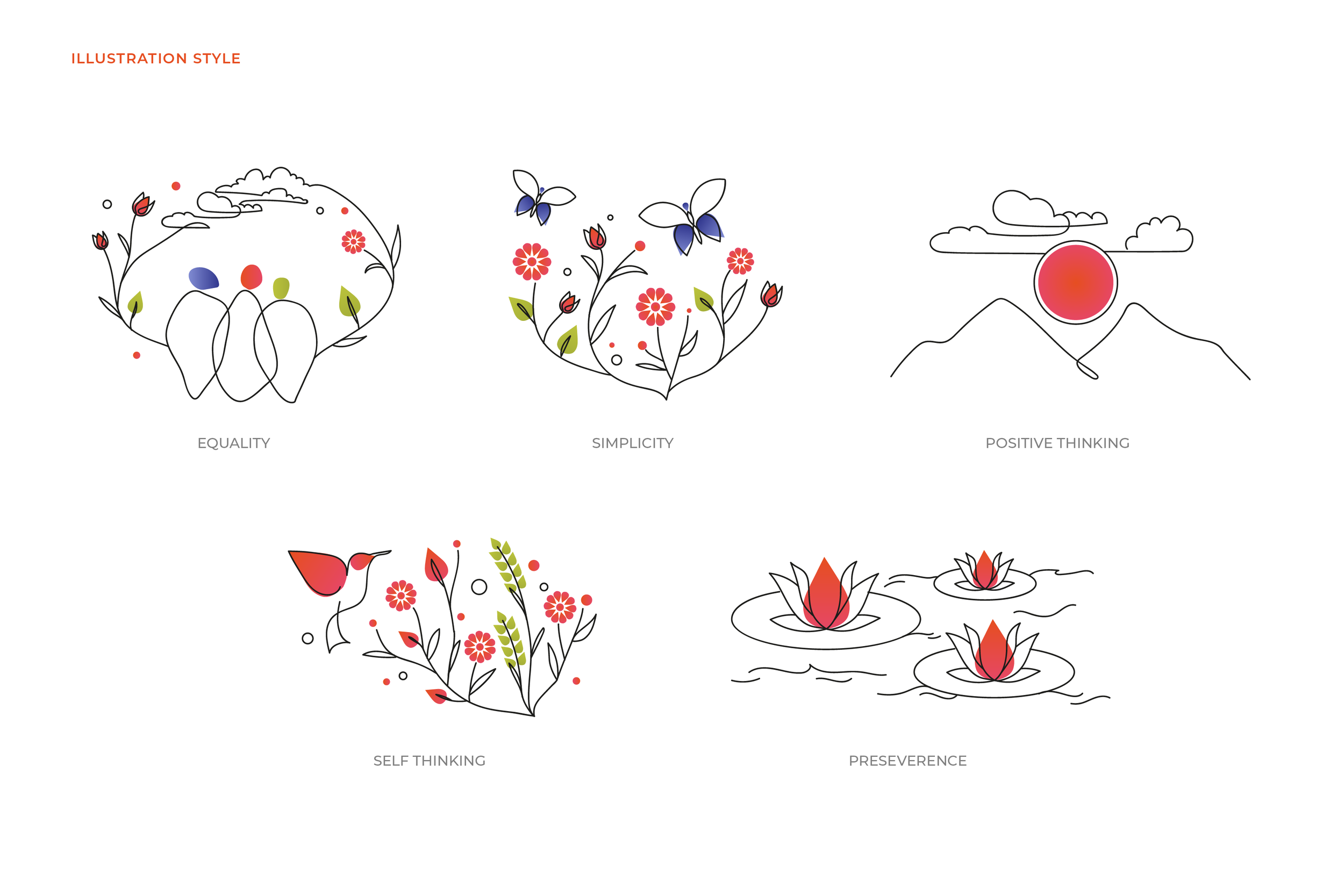
We further developed the illustration style to talk about complex ideas that the foundation deals with such as its values, mission and the emotions around dignity that the foundation throught its work is trying to address.